Carrie Bradshaw's Apartment: Get Her NYC Interior Style
This blog post contains affiliate links. For more information please visit our disclaimer page.
Carrie Bradshaw was not an interior designer. She was a woman who bought too many shoes and somehow still made her apartment look incredible.
That's the thing about her space- it wasn't decorated, it was accumulated. Pieces that meant something, layered over time, arranged with the kind of confidence that comes from knowing your own taste. The result was an apartment that felt entirely, unmistakably hers.
Which is exactly what most of us are trying to do.
The good news: the Carrie Bradshaw aesthetic is more achievable than it looks. It's not about budget- her apartment was famously rent-controlled, after all. It's about approach. Eclectic but intentional. Collected, not coordinated. Personal enough that a stranger could walk in and immediately know something about the person who lived there.
Here's how to get there.

Start With an Open Layout That Still Feels Full
Carrie's apartment was a New York City one-bedroom, which means it was small. What made it feel spacious wasn't square footage- it was the way the furniture was arranged to create distinct zones without walls.
The trick is multifunctional pieces that earn their place. A sofa that doubles as a daybed. A coffee table with storage underneath. A desk that works as a vanity. Each piece pulling more than one kind of weight.
Area rugs are the other tool she used well. In an open layout, rugs define zones- the living area, the reading corner, the entryway- without closing the space off. A good vintage rug does this and adds the kind of warmth and character that a new rug rarely achieves in the same way.
What to look for: A substantial rug in a warm tone or pattern, a sofa with clean lines but some age to it, and one or two pieces of furniture that feel like a find rather than a purchase.

Layer Textiles Like You Mean It
This is probably the single most Carrie Bradshaw thing you can do in a space, and it costs less than you'd think.
Her apartment was never sparse. Velvet cushions next to linen throws. Silk curtains pooling slightly on the floor. A mix of materials that made the space feel lived-in and considered at the same time. None of it matched perfectly- and that was the point.
The approach: pick a general palette (hers leaned warm- creams, blushes, a surprising green) and then layer within it freely. Different textures, different weights, different patterns that share a color family. The more you mix, the more intentional it starts to look- as long as there's a thread connecting them.
Vintage textile finds are particularly good here. A secondhand velvet cushion, a deadstock linen throw, a piece of fabric used as a curtain panel- these bring the kind of variation that makes layering feel like curation rather than clutter.
What to look for: Curtain panels with weight and movement, a throw in something tactile (boucle, velvet, chunky knit), and cushions in at least two different textures.

One Statement Piece Per Room
Carrie had a blue chaise. That's it. That was the whole living room argument- one piece that said everything about her point of view, and everything else supported it.
This is actually a useful principle for anyone trying to build a more interesting space: identify the one piece in each room that gets to have a personality, and let everything else play a supporting role. It takes the pressure off every other decision.
For a bedroom, it might be an ornate vintage headboard with clean bedding. For a living room, a worn leather armchair next to a more neutral sofa. For an entryway, a mirror with history in a frame that's slightly too interesting for the space.
Secondhand and vintage markets are where these pieces live. The kind of chair or table that immediately has a point of view- that reads as chosen, not assigned. That's the thing to look for.
What to look for: One piece per room that you'd describe to a friend. Something with a story, a shape, or a material that makes someone ask about it.
Build a Wall That Tells Something
The gallery wall in Carrie's apartment wasn't curated in the Pinterest sense. It was more like: here are the things I love, arranged until they worked. Prints, photographs, artwork in frames that didn't all match. The overall effect was personal in a way that a perfectly coordinated gallery wall rarely is.
The goal isn't symmetry- it's personality. Mix frame sizes, mix frame finishes, mix the work itself. A botanical print next to a black and white photograph next to something abstract. The common thread should be your eye, not a matching set.
Art from local artists, vintage print finds, or even pages from a book you love, framed well, all work here. The framing matters more than the art- a cheap print in a good frame reads better than an expensive print in a bad one.
What to look for: Frames in varied finishes (black, wood, gold, unpainted), prints with a point of view, and at least one piece that feels personal rather than decorative.

Color Is a Decision, Not an Accident
Carrie's apartment had color- just not in the way people expect. It wasn't painted a bold statement color and called it a day. The color lived in the objects: a green shelf, a blush cushion, a printed rug, a painting that pulled the whole palette together.
This approach- color through objects rather than walls- is particularly useful in rentals or spaces you're not ready to commit to painting. A room that reads as colorful and warm doesn't require paint. It requires objects with the right tone.
Start with one piece that has color you love- a rug, a piece of art, a ceramic- and build from there. Pull one color from that piece into a cushion, another into a curtain, another into a vase. The room starts to feel deliberate without feeling decorated.
For those who do want to paint: Carrie's apartment leaned toward warm whites and soft greens. Nothing bright, nothing stark. Colors that felt like a backdrop rather than a statement.

The Vintage and Thrifted Layer
This is where the Carrie Bradshaw apartment becomes accessible to anyone with patience and a good eye.
Most of what made her space feel distinctive wasn't expensive- it was specific. A vintage mirror with the right frame. A lamp that looked like it came from someone's grandmother's house (in the best way). A ceramic ashtray used as a jewelry dish on the nightstand. Objects that had been somewhere before they landed in her apartment.
This is the argument for secondhand shopping over retail. New furniture is designed to fit into any space, which means it rarely makes a space feel like your space. Vintage pieces come with character already built in. The job is finding the ones that fit your character.
Flea markets, estate sales, Etsy vintage shops- these are where the apartment-defining pieces tend to come from. The ones that make people walk in and immediately ask where you got it.
What to look for: Vintage mirrors, ceramic objects with presence, lamps with an interesting base or shade, framed artwork with a patina. Pieces that look like they've lived somewhere good.
The Personal Touches That Make It Yours
The last layer- and the one that's easiest to skip- is the personal one.
Carrie's apartment had books she'd actually read, a perfume collection on open display, photographs of people she actually knew. Not styled props- real objects from a real life, arranged with enough intention that they read as part of the design.
This is the part that can't be bought or copied directly. But the principle is: let the things you actually love be visible. Travel objects, books with spines you don't mind being read, a collection of something that doesn't need to be hidden. The goal is a space that reflects your life without being a museum to it.
The difference between a space that looks curated and one that feels personal is usually just this: the personal things were left in.

Recreating Carrie Bradshaw’s iconic NYC apartment is about capturing the essence of her eclectic and vibrant lifestyle while maintaining a sustainable approach. By focusing on secondhand treasures, unique furniture finds, and a colorful atmosphere, you can enjoy a stylish, accessible interpretation of this beloved space. Embrace your creativity and enjoy the journey of making your home a reflection of who you are- sustainably and stylishly.
SAVE FOR LATER:
MORE MOVIE AND TV INSPIRED INTERIOR DESIGN:
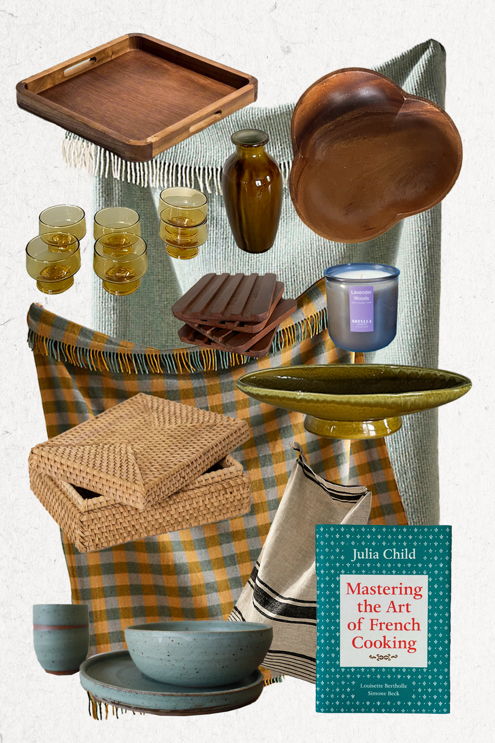
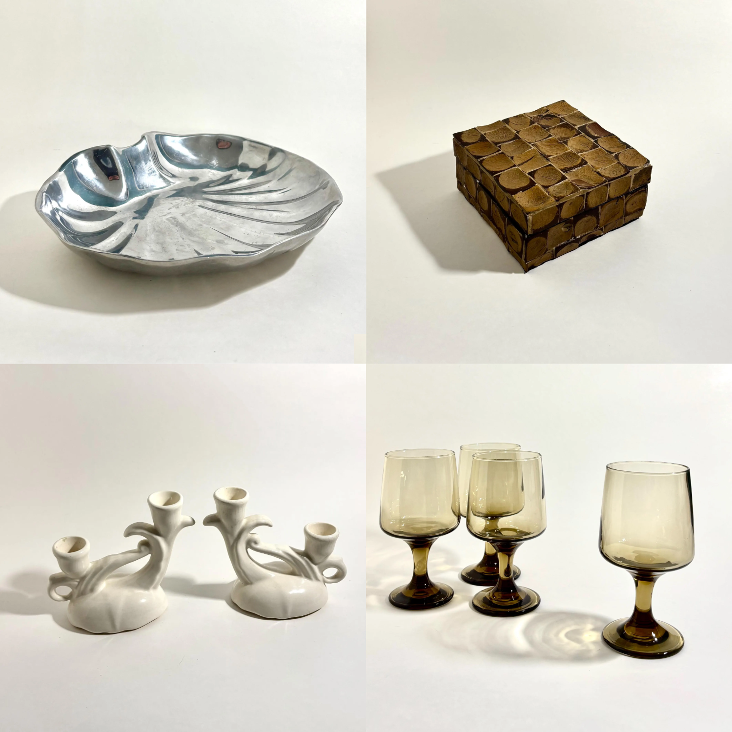
SHOP OUR CURATED OBJECTS:
MORE MOVIE AND TV INSPIRED ARTICLES: